Graphic Design · case study
Brand identity for a home-style tiffin service.
At a glance
A complete brand identity for a college exhibition project, including logo construction, wordmark, colour system and typography, translating the brand's meaning (nourishment, approachability) into visual form, then carried across packaging and promotional posters.
- Role
- Brand identity, Packaging design, Print & social
- Team
- Solo
- Tools
- Adobe Illustrator, Adobe Photoshop
- Deliverables
- Logo & wordmark, Colour system, Packaging, Posters & social creatives
- For
- College exhibition project
01 — The brief
An identity for everyday nourishment
Ahar is a tiffin (daily meal) service, created as a college exhibition project. The brief covered the whole identity: logo construction, wordmark, colour system and typography, then packaging across multiple touchpoints and promotional creatives.
02 — The mark
A grain, a letter, one flowing form
The mark combines an abstract grain form with the letter “a”, carved out of the grain in negative space, so the symbol leads straight into the lowercase wordmark.
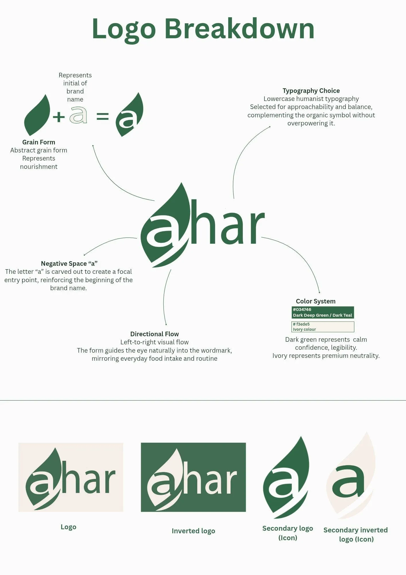
Grain form
An abstract grain form represents nourishment.
Negative-space “a”
The letter “a” is carved out to create a focal entry point, reinforcing the beginning of the brand name.
Directional flow
A left-to-right visual flow guides the eye naturally into the wordmark, mirroring everyday food intake and routine.
Typography
Lowercase humanist typography, selected for approachability and balance, complements the organic symbol without overpowering it.
Colour
Dark green represents calm confidence and legibility. Ivory represents premium neutrality.
03 — Identity system
Logo, inverted logo, icon
The system works in both directions, green on ivory and ivory on green, plus a secondary icon.
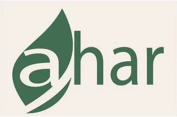
Logo
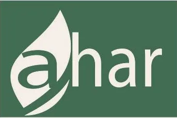
Inverted logo

Secondary logo (icon)
- Brand green#034746From the brand sheet
- Ivory#F3EDE5
- Kraft#C79D77Packaging stock
04 — Applications
Packaging, posters and social
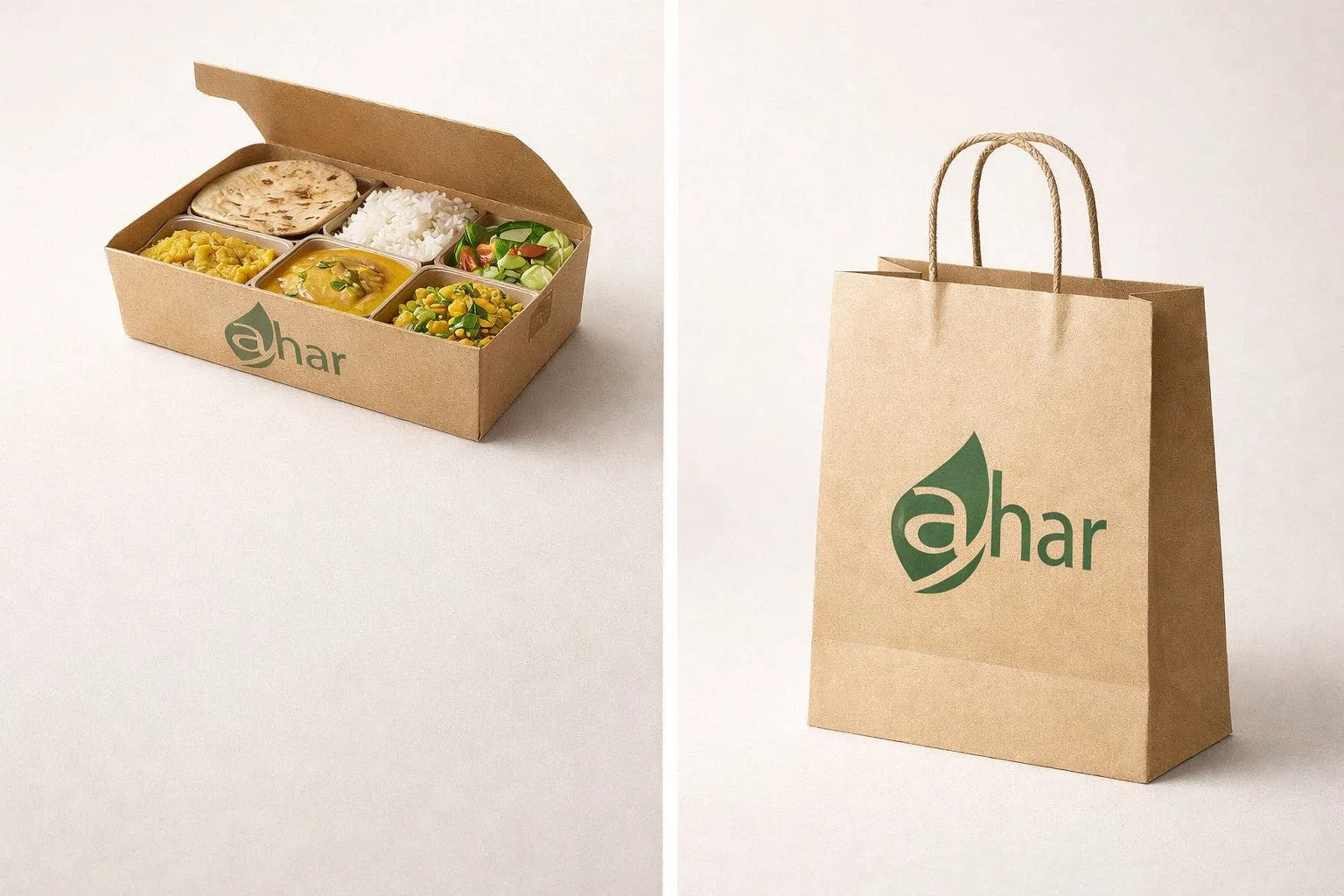
Packaging was developed across multiple touchpoints (delivery box, carry bag and container) with consistent brand application, alongside promotional social media creatives and service posters in the same visual language.
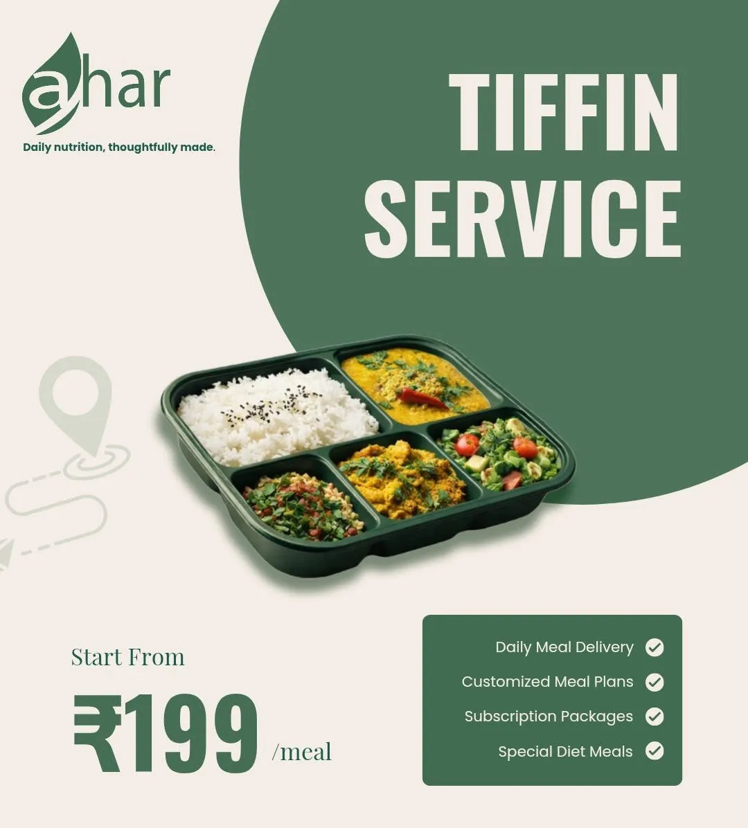
Service poster
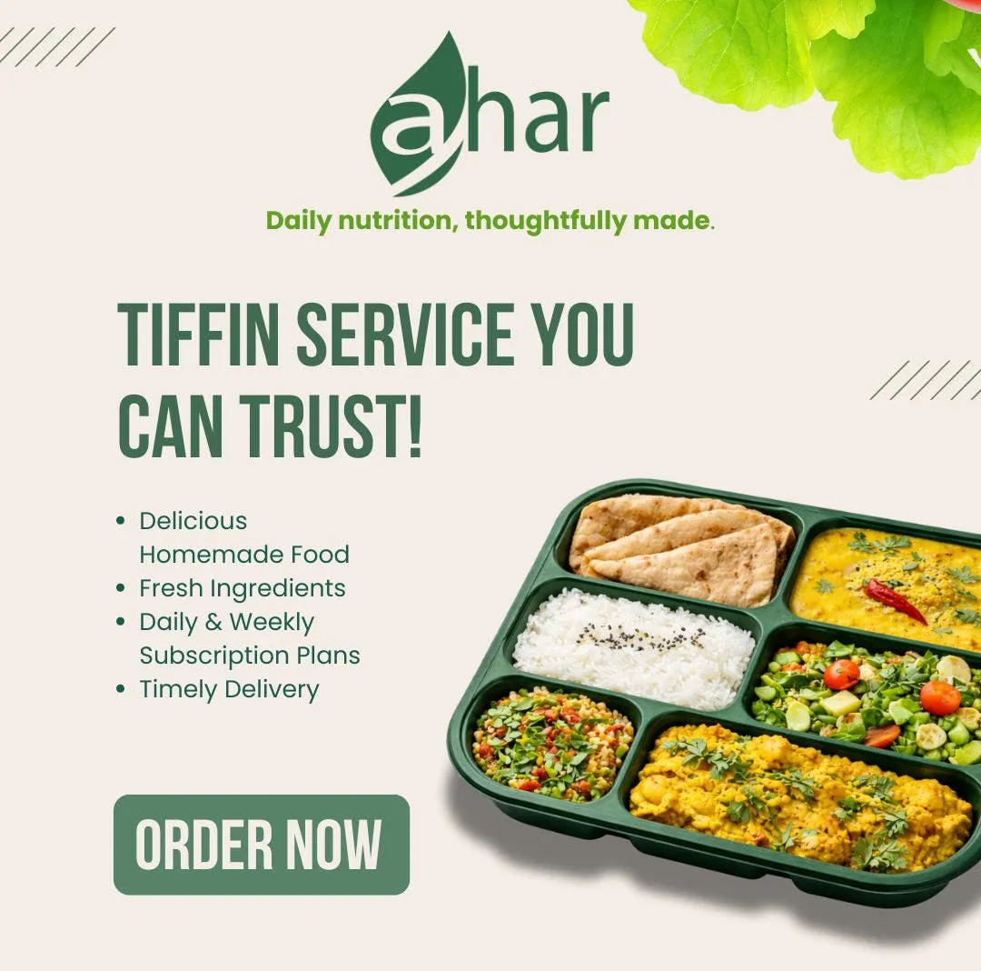
Promotional poster
Outcome
What it enables
- A complete identity system: logo construction, wordmark, colour and typography
- Consistent packaging across the delivery box, carry bag and container
- Promotional posters and social creatives in the same visual language
Reflection
Designing Ahar taught me how to translate the idea of healthy, balanced food into a visual identity that feels warm and approachable. My background in Nutrition and Dietetics helped me understand the brand from the inside, while design taught me how to communicate that story through color, typography, and visual language. It showed me how thoughtful design can make a brand feel both trustworthy and inviting.
Work with Ramankita
Have a project in mind?
Identity, packaging, print or UI: a short inquiry form.
Start an inquiry →